Sign in. It’s quick, free and it’s up to you.
An account is an optional way to support the work we do. Find out more.
Sign in. It’s quick, free and it’s up to you.
An account is an optional way to support the work we do. Find out more.
Updated 21:59
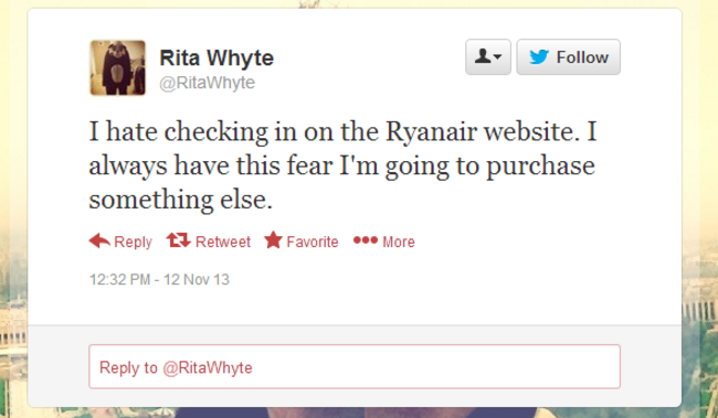
FOR MANY YEARS, the Ryanair website has been the source of much angst for its customers.
Potential passengers frequently complained about the bad design, the many requests to purchase add-ons for their flights, and the decidedly non-user-friendly experience.
The company took pride in its no-frills approach online, pointing out that the website was still massively successful, despite the design problems.
However as part of the Ryanair 2.0 which has emerged in recent months – including the announcement that seats are to be allocated from next year and that fees for reissued boarding cards are to be reduced, both of which were previous stalwarts of Ryanair’s back to basics policy – the website has now undergone a significant overhaul.
The Ryanair Twitter account announced the new site this morning, telling customers: “We have a surprise for you!”. It described the new site as the “1st of many changes for Ryanair.com”.
It comes a day after the airline announced 300 new jobs for Ireland and a number of new routes out of Dublin Airport from next year.
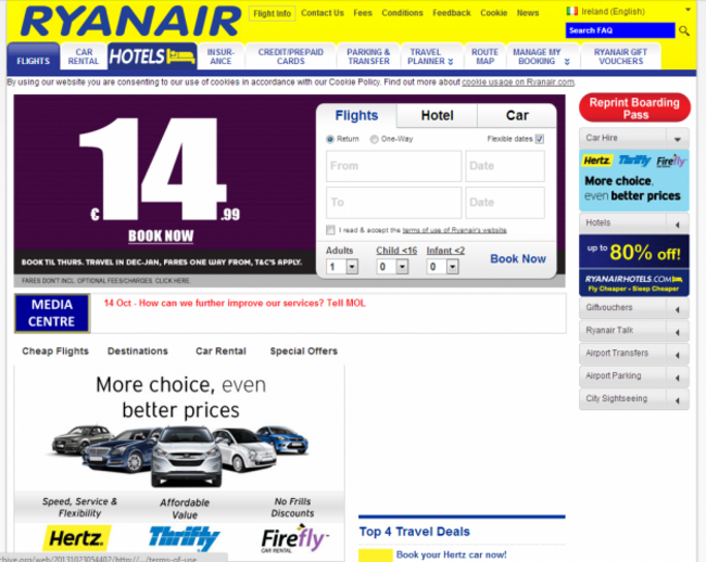
Here’s how the site looked up until last night:
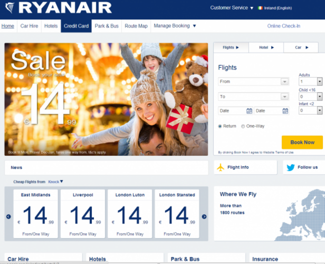
And here’s how it looks now:
What do you think? Any better?
First published 11:47
To embed this post, copy the code below on your site
have your say