Advertisement

We need your help now

Support from readers like you keeps The Journal open.

You are visiting us because we have something you value. Independent, unbiased news that tells the truth. Advertising revenue goes some way to support our mission, but this year it has not been enough.

If you've seen value in our reporting, please contribute what you can, so we can continue to produce accurate and meaningful journalism. For everyone who needs it.
FACTCHECK

Debunked: Misleading graph used to argue that non-vaccinated people achieved ‘Zero Covid’

Unvaccinated people appear not to be affected by the disease — until you count deaths

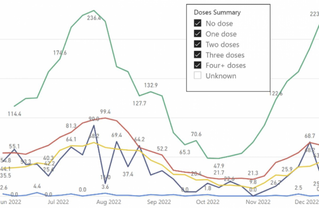
A SCREENSHOT OF a graph, supposedly showing COVID-19 rates in the Australian state of New South Wales (NSW), has been used to argue that non-vaccinated people have lower rates of the virus.

The graph, created by a social media user, is misleading. The purported source the graph’s data – a report by the Australian Ministry of Health – actually shows that unvaccinated people are disproportionately more likely to die from the disease.

The graph was posted on social media by one Irish commentator, who regularly makes controversial claims about COVID-19 — including one in summer of 2020 that 80% of people were already immune to COVID-19 due to exposure to other coronaviruses (not true), so “herd immunity” was already reached.

His description for the graph we’re looking at in this debunk reads: “#Australia – non-vaggzed are the winners for minimum Covid – by a country mile!

“In essence the non-vaggzed have achieved….ZERO COVID!” [sic]

The word ‘vaggzed’ is a deliberate misspelling of ‘vaccinated’, in an attempt not to be picked up by moderators on social media websites.

Initially, the graph looks convincing.

Its title reads: “NSW Health Surveillance Data”.

An explanation below the graph says shows the “total measured events” per population, grouped by how many vaccine doses they had received. 

It shows that unvaccinated people have barely any “events” at all.

However, the term “events” isn’t defined, and tracing this graph back to its source shows major issues.

What the graph means

The screenshot is not of an official graph, but rather the creation of a Twitter user who has regularly made spurious claims about vaccines — such as that recipients shed spike proteins, harming people around them (they don’t).

The Twitter user links to official NSW government data that he describes as his “sources” on the original graph; however, none of the figures used on the graph appear in these links. 

By analysing the graph data, as well as an earlier Twitter thread by the graph maker that outlines part of his process, The Journal has determined that the charts have a glaring omission: deaths are not included, either as “events” or anywhere else.

This omission is included in the screenshot of the graph shared by the Irish commentator to make the claim that unvaccinated people had achieved “Zero Covid”.

The screenshot

It appears to show that, as of December 10, vaccinated people had many times the number of “events” that unvaccinated people did. NSW health department figures — the supposed source of the graph’s data — show something different.

The maker of the graph only counted one unvaccinated person who had an “event”, a hospital admission with COVID-19. In doing so, they ignored the six people who died with the disease included in the NSW government data — more than 10% of that week’s total deaths.

This is a disproportionately high number of deaths with a COVID-19 diagnosis, given that less than 3% of people aged 16 or over in New South Wales were unvaccinated at that time (the data shows no one younger than 50 dying with COVID-19 that week).

The report the data is from says: “With such high vaccination coverage in the community, a high proportion of people admitted to hospital or intensive care unit (ICU) with COVID-19 are now vaccinated with two or three doses.

“However, people who are not vaccinated remain more likely to suffer severe COVID-19.”

The report also notes that some of those counted as being admitted to hospital or ICU are there “for conditions unrelated to their COVID-19 infection, and these admissions will not be prevented by vaccination”.

Oddly, the data that the graph omitted appears to be the most accurate indication of COVID rates, as the report says that the same limitation mentioned above does not apply: “Deaths may be excluded if there was a clear alternative cause of death that was unrelated to COVID-19 (e.g. major trauma).”

Verdict

Data from New South Wales does not show that unvaccinated people have achieved “Zero Covid”. Such claims are FALSE.

Graphs implying this were made by a vaccine sceptic who removed death data showing that unvaccinated people were dying at a disproportionately high rate in New South Wales.

The Journal’s FactCheck is a signatory to the International Fact-Checking Network’s Code of Principles. You can read it here. For information on how FactCheck works, what the verdicts mean, and how you can take part, check out our Reader’s Guide here. You can read about the team of editors and reporters who work on the factchecks here.