Sign in. It’s quick, free and it’s up to you.
An account is an optional way to support the work we do. Find out more.
Sign in. It’s quick, free and it’s up to you.
An account is an optional way to support the work we do. Find out more.
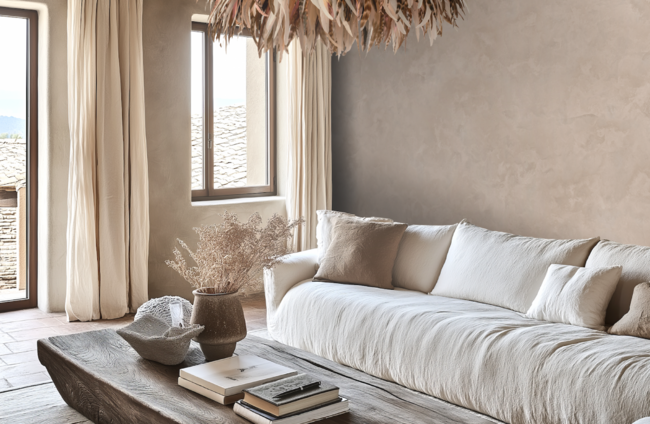
EACH YEAR THE Pantone Colour of the Year (COTY) is a hotly anticipated announcement. We tuned in to find out what Laurie Pressman, VP of the Pantone Color Institute, had to say about the choice of Mocha Mousse as the colour of the year for 2025.
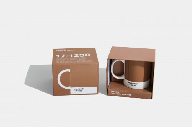
We’ve all heard of Pantone but what exactly is it and how does it dictate the colour of the year? Pantone is a system that provides a universal “language of colour” that enables colour-critical decisions for brands and manufacturers. Millions of designers and product producers around the world rely on the Pantone system to help “define, communicate and control” the colour of their products or brand each year as it is used to achieve consistency of colour across a myriad of materials and finishes in many different sectors including fashion design, graphic design, product design and interiors. It’s also what allows brands to keep their brand colours uniform whether they’re putting their logo on a t-shirt, billboard or on their packaging.
Whether you’re talking digital or physical colours specification, the Pantone Matching System™, founded in 1963 and now consisting of over 10,000 colour standards, is a system that provides a consistent, accurate and standardised set of colours to be used wherever you see that colour represented.
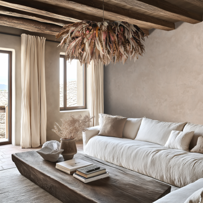
The Pantone Color Institute™, is a consulting service within Pantone that “forecasts global colour trends and advises companies on colour in brand identity and product development”. The institute is recognised around the world as a leading source of information on colour which produces seasonal trend forecasts and which develops custom colours and palettes for product and corporate identities which will connect with consumers.
Each year the Pantone Colour Institute selects the colour that it believes captures the global zeitgeist. Last year the colour chosen was Peach Fuzz – a warm, gentle peach tone “resonating with compassion” and “bridging the youthful with timeless elegance”.
This year’s Pantone Colour of the Year is Mocha Mousse 17 – 2030 which is an evolution of last year’s warm, natural tone and comes as no surprise to many as brown tones have become familiar to us – becoming key tones in the trend for quiet luxury and in the pursuit of more natural colours in both fashion and interior design.
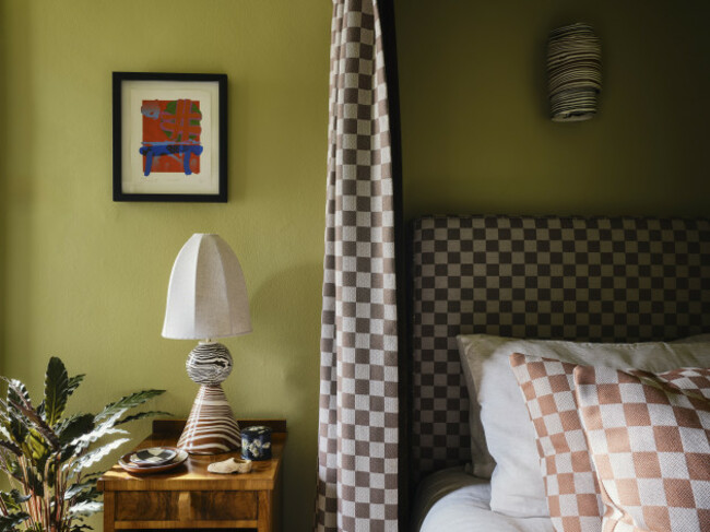
According to Pantone, Mocha Mousse is a “warming, brown hue imbued with richness”. The colour brings to mind thoughts of comfort and nurturing with its suggestion of “the delectable qualities of chocolate and coffee”. Mocha Mousse is all about creating special moments to reconnect with ourselves and others by curating experiences that boost personal comfort and wellness.
While you’re guaranteed to see this soothing, rich colour everywhere in fashion it is also a colour that we’ll see across interiors and home products this year. Pantone create their own range of products so you can jump on the trend but they have also worked with partners including Motorola, Joybird, Libratone and Spoonflower to create custom products inspired by the colour of the year.
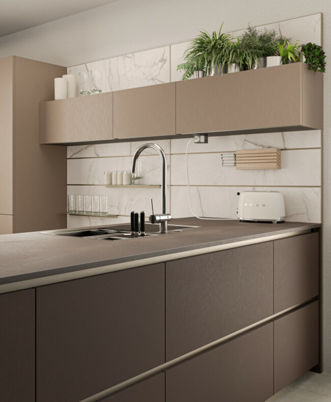
We tuned in to hear Laurie Pressman, VP of the Pantone Color Institute, explain the thoughts behind the selection of Mocha Mousse as the colour of the year for 2025.
Pressman explains that the selection of the COTY is not an arbitrary choice – the selection of the colour includes thoughtful consideration and trend analysis and is a culmination of the colour forecasting and research done by the institute each year. Influences include design, aspirational travel destinations and many aspects of design as well as socio-economic conditions and new technologies or materials.
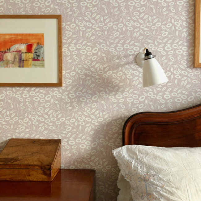
Pressman says that the “emotional aspect of colour” is a large part of the annual decision making process as the institute ensures that the colour chosen reflects “what’s taking place in our global culture at a specific moment in time”. “With colour and context so intertwined, there really are reasons why a particular colour family or individual colour comes into prominence when it does,” she says.
The name of the colour is also considered carefully to ensure that it is “directly in tune with the message we are looking to send”.
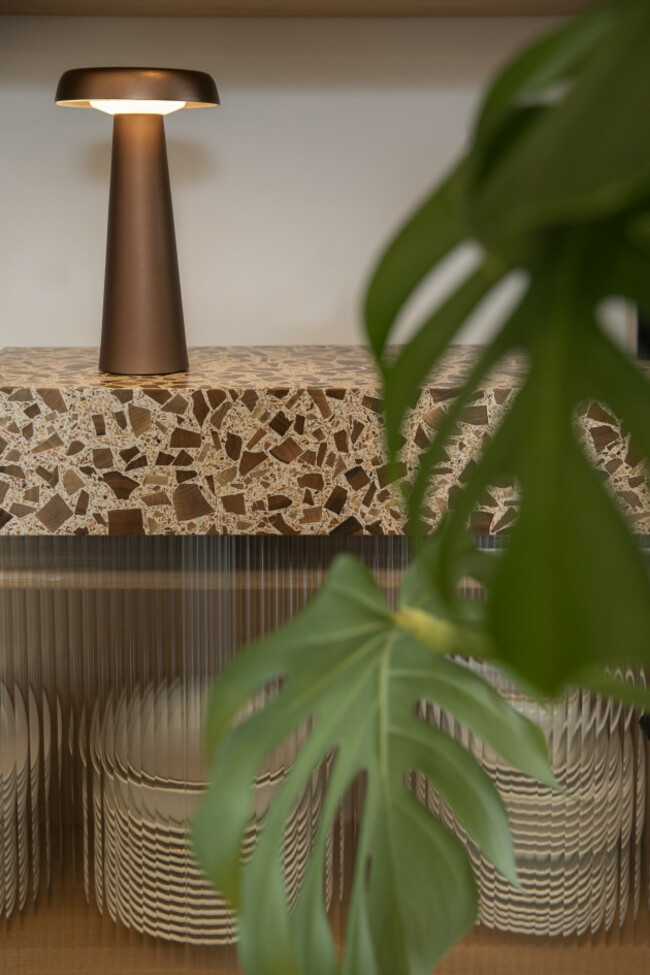
The COTY is unique each year and can represent a divergence of a trend or an evolution of a trend as is the case this year “leaning further into our desire for comfort and harmony”. The evolution of last year’s Peach Fuzz colour is seen as reflective of our desire for harmony in our relationships, social connections and with the natural environment around us. This year’s colour is all about harmony, peace, calm, balance, connection and unity themes we can certainly get on board with.
Pressman says that there is an increased trend of seeking joy in ordinary moments and in elevating the everyday – creating fleeting escapes which bring us joy through simple things like sweet treats or a walk in nature.
“Mocha Mousse is a richly mellow soft brown whose sensorial and comforting warmth transports our senses into the pleasure and deliciousness it inspires,” says Pressman. “It is an evocative brown tone that embodies our desire for balance and unity and the feeling of peace and unity it engenders.”
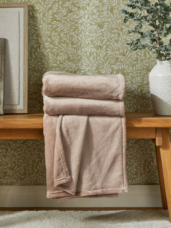
In terms of our homes this is a thoughtfully indulgent tone which is rich and lush yet unpretentious and a bit of a classic. It is a versatile luxe shade that is genderless and seasonless – a neutral and practical shade which can stand alone or work as a building block with other tones.
Mocha Mousse is all about a “low key elegant vibe” says Pressman and is a reflection of our desire to reconnect with the natural world and with our environment. Browns such as Mocha Mousse are considered to be “stable, grounded, honest, authentic and timeless”.
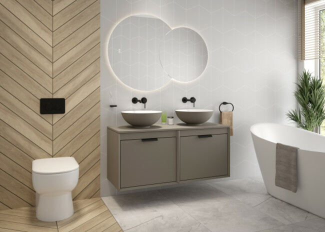
When it comes to the home, Pressman recommends contrasting these light browns with crisp whites to achieve lightness rather than the heaviness often associated with brown tones.
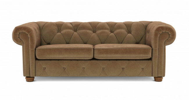
Tap into ideas of Mocha Mousse through the introduction of natural materials such as leather, suede, wicker, linen, wood and natural stone as well as through the use of paint colours and printed fabrics and wallpapers to create a warm, yet modern look.
Think fuzzy boucle furniture pieces, fluffy towels, cosy throws, neutral candles and organic tableware. This is a versatile hue which represents warmth and a return to nature and which goes beautifully with a wide range of colours including other neutral tones as well as pinks, blues and greens.
To find out more about Pantone and the Colour of the Year go to www.pantone.com.
Main image coldharbourlights.com.
To embed this post, copy the code below on your site





have your say