Sign in. It’s quick, free and it’s up to you.
An account is an optional way to support the work we do. Find out more.
Sign in. It’s quick, free and it’s up to you.
An account is an optional way to support the work we do. Find out more.
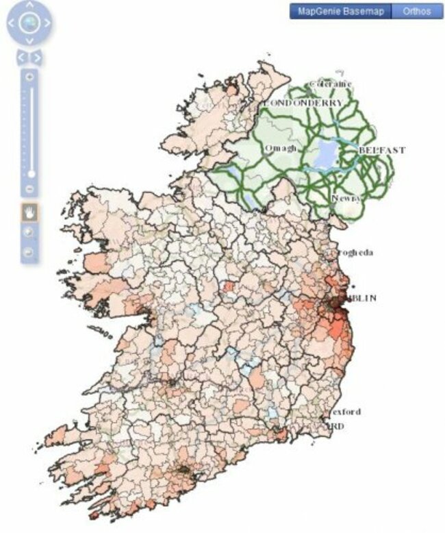
IRELAND’S CRASHING PROPERTY market over the past five years has been mapped in full graphic detail as part of a project by academic researchers and a property website.
The maps show the average prices and rents for more than 1,000 areas across the country based on over 1.1 million Daft.ie records since 2007.
Researchers at AIRO, the All-Island Research Observatory, put together the maps which allow users to compare how rental prices and sales prices changed across the country over the past five years.
Economist Ronan Lyons said that the maps show “not only how volatile trends can be from neighbourhood to neighbourhood but also what structural changes are occurring in the property market, with smaller properties seeing the largest falls in prices”.
The graphics show that the typical fall in house prices – which are down around 54 per cent from their 2007 peak – is more than twice the size of the drop in rents, which have fallen by 29.4 per cent.
(Images: AIRO/Daft)
Disclosure: Daft Media Ltd is part of the Distilled Media group. Journal Media Ltd has shareholders – Brian and Eamonn Fallon – in common with Distilled Media Group.

To embed this post, copy the code below on your site












have your say