Sign in. It’s quick, free and it’s up to you.
An account is an optional way to support the work we do. Find out more.
Sign in. It’s quick, free and it’s up to you.
An account is an optional way to support the work we do. Find out more.
APPLE REGULARLY HIGHLIGHTS its design choices and attention to detail as some of the reasons why its products are different to its rivals.
It even goes as far as to use a specific font type called San Francisco for OS X El Capitan and iOS 9.
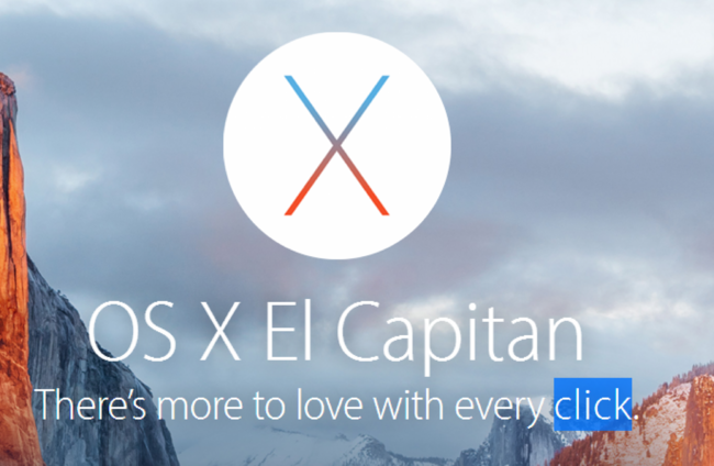
Yet the font itself presented a problem for a certain word on its site. Because of the spacing used on its main page for OS X, it meant that the word ‘click’ looked more like ‘dick’.
A little problematic when the sentence in question is “There’s more to love with every click”.
So what did Apple do? It made a small tweak to the website’s CSS code, placing ‘span’ HTML tags around the word click so it’s spaced out a little more.
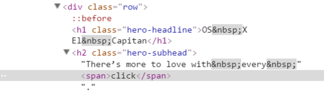
The change was first spotted by software designer Dan Leech which you wouldn’t notice unless you were actively looking for it.

And for those who can’t see it, a number of people sent in comparisons and changes that make the decision a lot clearer.
Although that didn’t stop others from taking liberties with it and making their own changes.

To embed this post, copy the code below on your site














have your say