Sign in. It’s quick, free and it’s up to you.
An account is an optional way to support the work we do. Find out more.
Sign in. It’s quick, free and it’s up to you.
An account is an optional way to support the work we do. Find out more.

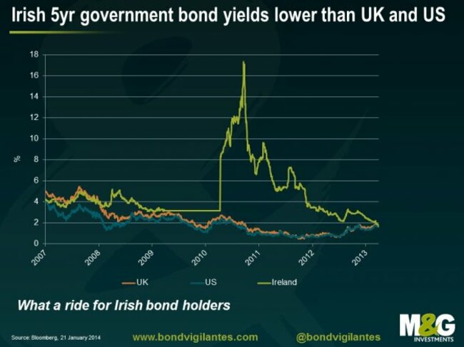
Need a larger version? Click here. (Image: @BondVigilantes/Twitter)
HERE’S A STUNNING chart that shows Irish five-year borrowing costs against the equivalent for the UK and the US.
During the heat of the eurozone crisis, Irish yields soared. Today, Ireland is borrowing for less than the UK and the US.
The chart kind of tells the whole story of Europe. During the crisis, the big fear was default, and so investors demanded sky-high yields to be compensated for the risk that Ireland (or one of its peripheral counterparts) would miss a payment and possibly leave the eurozone.
That fear is no more. The new fear among euro area countries is a slowing economy and deflation.
Ireland is borrowing for less than the UK and the US not because it’s deemed to be a better credit risk — it’s not — but because the economy is expected to be weak and inflation is expected to be non-existent.
(Conversely, yields in the UK and the US have been trending a bit higher on hopes of a breakout in economic strength).
This one chart therefore tells so much about what happened over the last few years, and how the story has dramatically changed.

To embed this post, copy the code below on your site














have your say