Sign in. It’s quick, free and it’s up to you.
An account is an optional way to support the work we do. Find out more.
Sign in. It’s quick, free and it’s up to you.
An account is an optional way to support the work we do. Find out more.

HUMANS ARE NOTORIOUSLY bad at assessing risk. It’s why someone might light up a cigarette while talking about how worried they are about a terrorist attack.
And why so many of us drive to work every day but feel nervous getting on a plane.
To help make sense of all of this and put it into perspective, the UK’s National Health Service put together the Atlas of Risk.
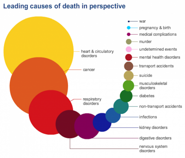
So, here are the leading causes of death in the UK, with larger circles representing more common causes:
And the top risks leading to death:
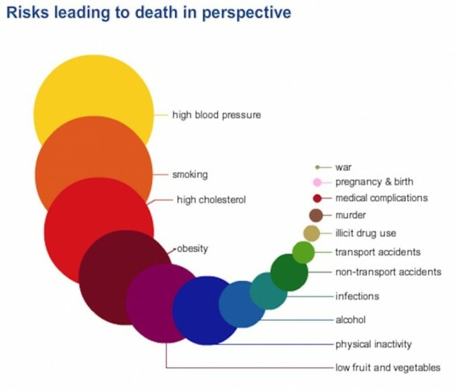
The charts above are averaged among the population but on the NHS site you can tailor these charts to your sex and group. The main idea is to visually show that our fears are often misplaced and that most of us should worry more about quitting smoking and eating vegetables than dying in a murder freak accident.
“It’s easy to lose perspective and worry about small or insignificant risks while ignoring, or being unaware, of the major threats,” the NHS explains on its site. “The NHS Choices Atlas of Risk has been designed to help put health threats into perspective”.

To embed this post, copy the code below on your site













have your say