Sign in. It’s quick, free and it’s up to you.
An account is an optional way to support the work we do. Find out more.
Sign in. It’s quick, free and it’s up to you.
An account is an optional way to support the work we do. Find out more.

BACK IN OCTOBER, Viagra decided to change its packaging in Russia to give consumers a clearer idea of the effect its product would have on them.
While Viagra didn’t change its logo worldwide this year, a number of other prominent brands did.
Some organisations, like Airbnb and Netflix, used the opportunity to communicate an entirely new vision. Others, like Volvo and WWE, made only small tweaks to update the logos they were already using.
Hershey
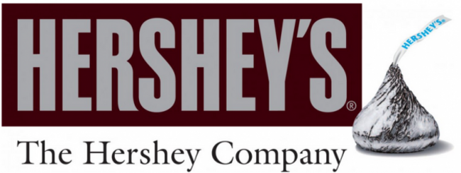
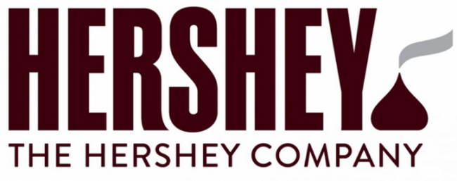
Hershey’s old logo simulated the wrapper of its iconic chocolate bar.
The new logo is meant to also include other Hershey brands like Reese’s and Milk Duds.
Netflix
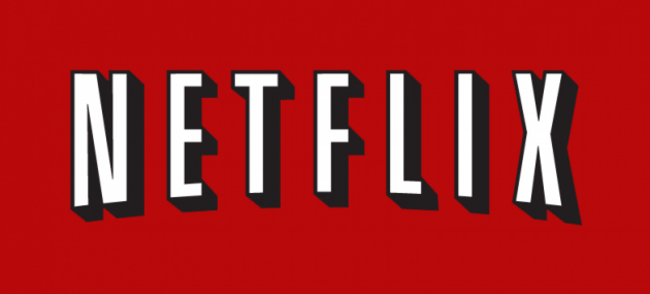
Netflix’s old logo used the bold, block lettering associated with Hollywood.
The new logo is a bit simpler and a better fit for the digital era.
WWE
WWE’s old logo was known for its “scratchy” Ws.
Its new logo is crisp and professional.
Airbnb
The letters in Airbnb’s old logo were reminiscent of the air mattresses that inspired the site.
Its new logo was mocked for looking very sexual.
Volvo
Volvo had been using this logo since the late 1990s.
The new logo offers a nice, modern update.
Bacardi
Bacardi’s old logo featured the brand’s iconic bat.
The new logo has a smaller bat and a cleaner design.
Black + Decker
Black & Decker’s old logo used an ampersand to connect the names of the brand’s two founders.
The new logo uses the trendier plus sign instead.
Reebok
Reebok’s old logo was never quite as famous as the Nike Swoosh.
But its new logo makes the brand look more like a B2B software company.
Visa
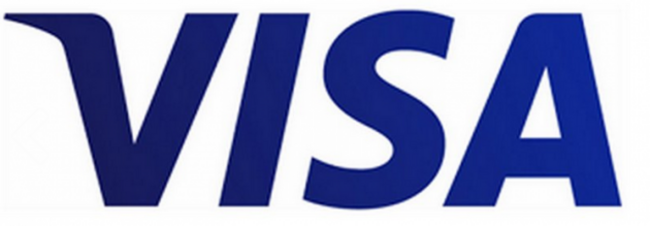
Visa’s old logo famously had a golden tip on the ‘V.’
The new logo gets rid of this flourish. The letters are also darker shades of blue.

To embed this post, copy the code below on your site












have your say